Choosing the Academic Type as my typesetting service was one of the best decisions I could make in the final steps of my PhD thesis. They were very professional, provided excellent creative suggestions, and always responded to my queries promptly. The price they offered was competitive, budget-friendly, and excellent value for money. I was extremely happy with the final look of my manuscript, and I strongly recommend their services!
Nina Mileva
Goal
Nina’s specialty is public international law. She wanted her thesis to have a classic and elegant look that conveys seriousness. The thesis also had to look clean and neat with as little clutter as possible.
Typeface
Typography sets the visual tone for a piece of text. Nina wanted a typeface that has a long history while remaining readable and approachable to the modern audience. Together we decided to use Baskerville typeface, which dates back to 1757. This traditional font gives printed words more weight and captures the reader’s attention.
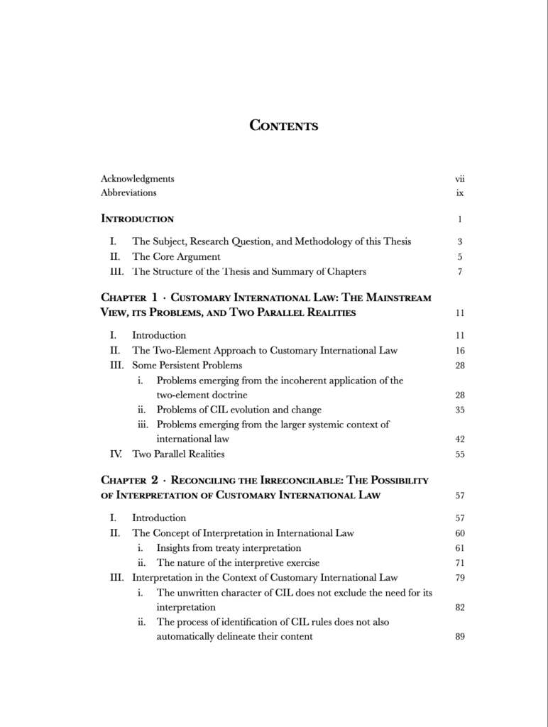
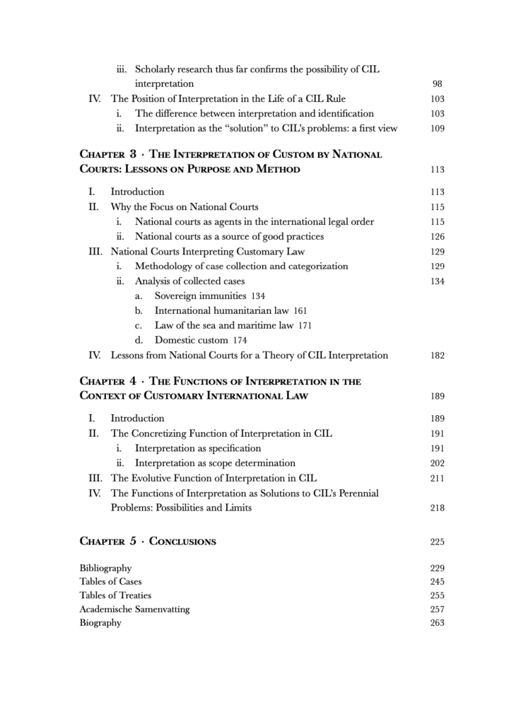
Contents page
We chose to use a small capitals font for the chapter titles to exhibit the beauty of Baskerville typeface. To improve reading efficiency, instead of right aligning all the page numbers, we allowed the page numbers for sub-subsections to follow the entries immediately.
Footnotes
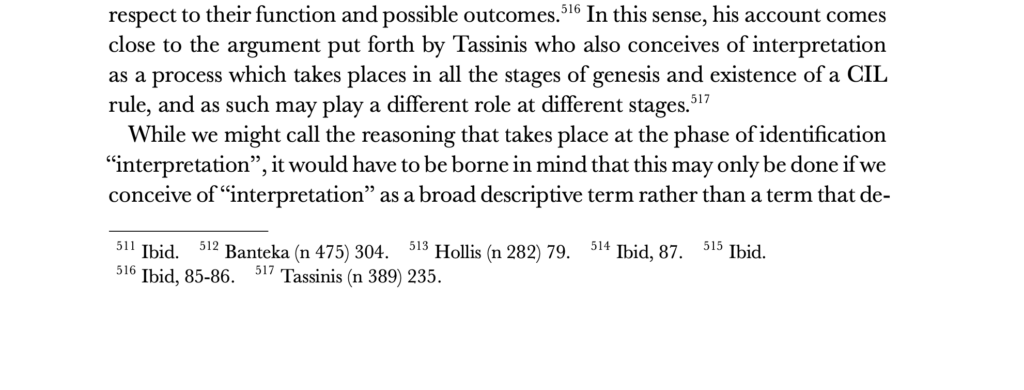
In law papers, it is very common to have many “Ibid’s” in the footnotes on the same page. This often leads to a lot of unnecessary white space in the footnote section of a page. We solved this problem by using what is termed “in-paragraph footnotes” in LaTeX, which allows short footnotes to be presented next to each other horizontally rather than just vertically.
Nina’s complete thesis